It was pointed out to me by my lecturer that I didn’t have a brand identity for the “company” behind my posters. 
I am wanting to create a logo for the brand/company who are “behind” the campaign posters I am creating. As you can see the composition is the same on most of the designs with the company name centred underneath the logo and usually, only one colour is used.

In terms of composition, on all global warming campaign posters, you see the commissioner’s logo on the bottom left or right corner. The logo is usually small and doesn’t draw your attention away from the message.

Here are a few logo ideas I came up with. The company would be called ‘Protect the Planet’. I really want the earth to be the main focus in the logo. My favourite ideas are the world inside in a bubble and the men holding up the world.
![]()
Logo design is one of the elements of graphic design that I am most interested in, although at the moment its the element that I find the hardest. My favourite design at the moment is the man holding the world. As logos are simple and should be one colour I have created a black silhouette version. As holding a solid black ball in the air due to only using one colour I didn’t look right, I created a planet with a ring around it like Saturn. I like the logo but I would have really liked the earth to be the main part of the logo.

Here is what the logo looks like on one of my posters. To be honest, I prefer the posters look better without the logo.
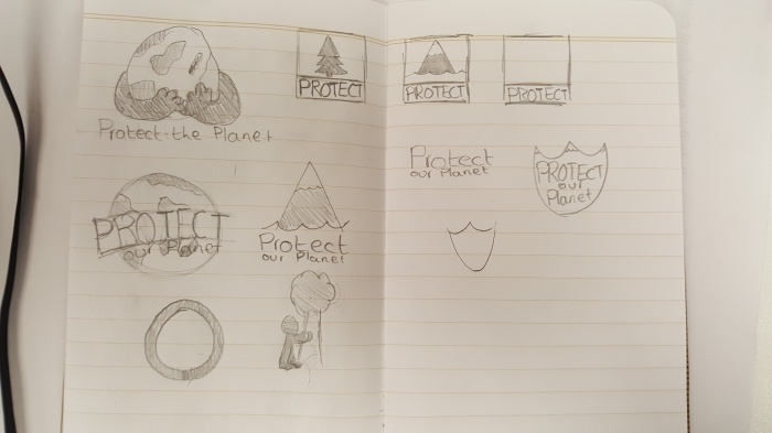
I really like minimal rustic logos so have had a look at shield designs but having a shield that looks like the earth is proving difficult.
