Innocent
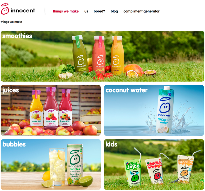
Innocent are a healthy drinks company that were established in 1999 after selling lots of smoothies at a music festival. We put up a big sign asking people if they thought we should give up our jobs to make smoothies, and put a bin saying ‘Yes’ and a bin saying ‘No” in front of the stall. Then we got people to vote with their empties. At the end of the weekend, the ‘Yes’ bin was full, so we resigned from our jobs the next day and got cracking (Innocent Drinks, 2017). Since then Innocent have created juices, smoothies, bubbly drinks and more.


In 1999, when the company started, they didn’t hire a design agency to design the branding instead they did it themselves. Once the branding started to look outdated, Innocent went to Pearlfisher for a design refresh. There were three main concepts that Germain says underlined what Innocent stood for, and these had to be incorporated in the design refresh: home-made, natural looking and a bit posh. (Creative Bloq, 2007)
That process started away from the computer screens as the team at Pearlfisher sat armed with sketch pads in a room with astroturf on the floor, pictures of nature on the wall and plenty of Innocent products around to provide inspiration.(Creative Bloq, 2007)
“We were creating new symbols for the range and you can’t do it all from a computer – computers can’t do the ideas for you,” says Ford.(Creative Bloq, 2007)
The design changes were subtle but important, with the dude moving into a central position and the typography getting a makeover. The result was more balanced, with an infusion of colour. The caps, which had been a plastic shade of gold, were replaced by a clear white that didn’t conflict with the colour of the drink.(Creative Bloq, 2007)


